
 Widget and Design
How to Customize Widget Design
Customize your Bird Pickup & Delivery widget appearance to match your store’s design.
Access Widget Design Settings
- Go to Shopify Admin
- In the left sidebar, locate Apps
- Find and click Bird Pickup & Delivery
- Click Settings for the app
- Click the Widget Design section
Note: Always click Save after making changes to apply them.
Basic Widget Customization
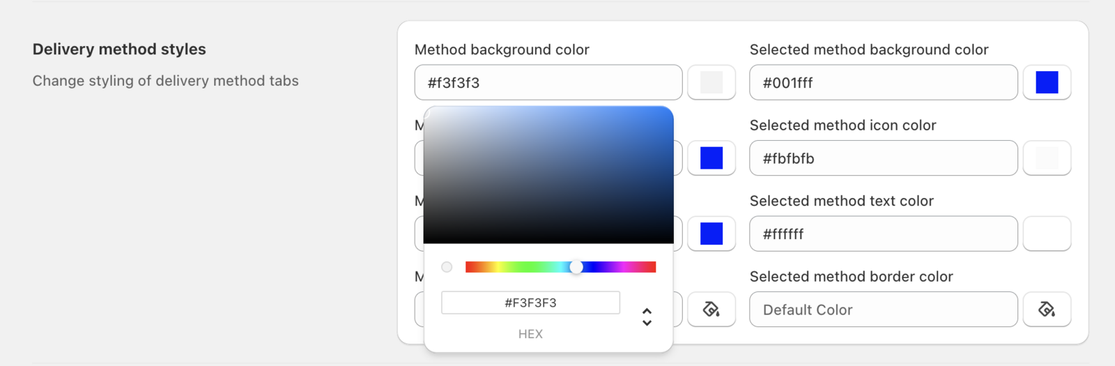
Change Widget Background Color
- In Widget Design settings, locate the background color option
- Click the color palette icon next to background color
- Select your preferred color from the color picker
- Click Save to apply changes
Tip: Use your brand’s hex colors (e.g., #FF6B35) or choose from Shopify’s color palette. Ensure sufficient contrast for accessibility.
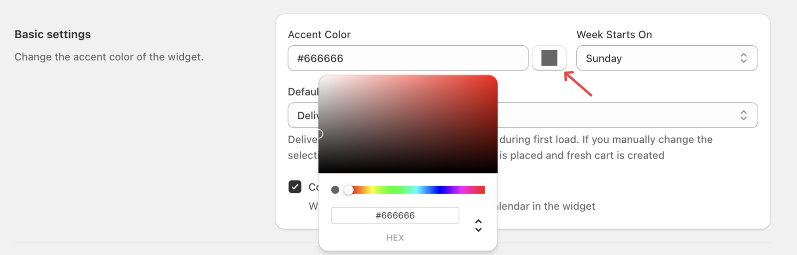
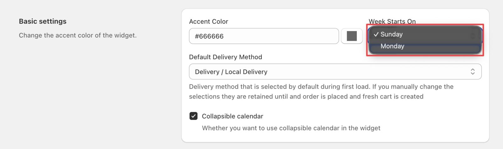
Set Week Start Day
- In Widget Design settings, locate the week start option
- Choose between Monday or Sunday as your week’s first day
- Click Save to apply
What this does: Controls which day appears first in your calendar view. Choose Monday if your business week starts Monday, or Sunday for traditional calendar layout.
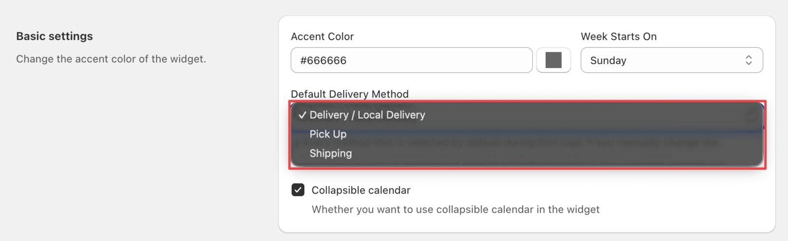
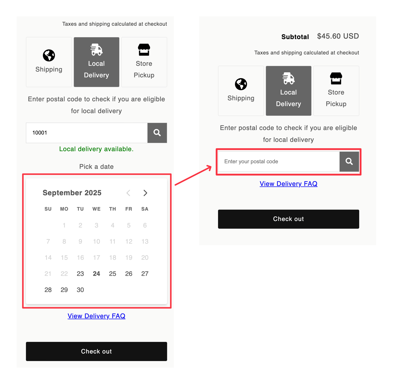
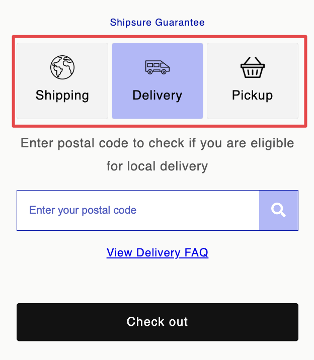
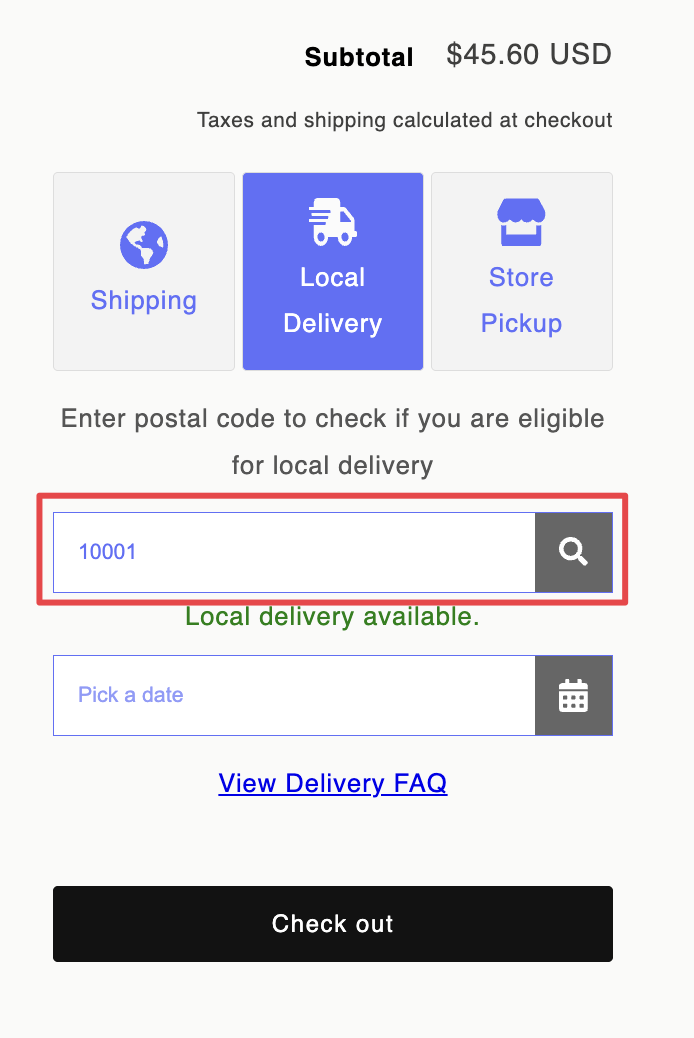
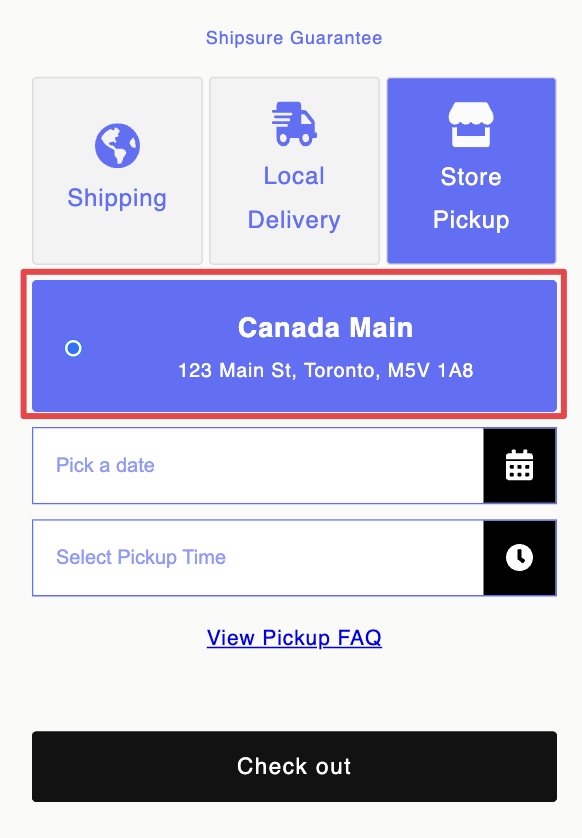
Configure Default Delivery Method
- Find the default delivery method setting in Widget Design
- Select your preferred default option
- Click Save to apply
What this does: Sets which delivery option (shipping, local delivery, or pickup) is pre-selected when customers first see the widget.
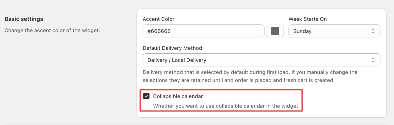
Enable Collapsible Calendar
- Locate the collapsible calendar checkbox in Widget Design
- Keep the checkbox enabled for collapsible functionality
- Click Save to apply
What this does: Allows customers to expand/collapse the calendar to save space on your cart page. When collapsed, only the date picker shows.
Advanced Styling Options
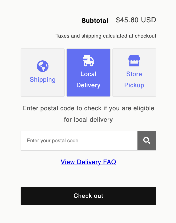
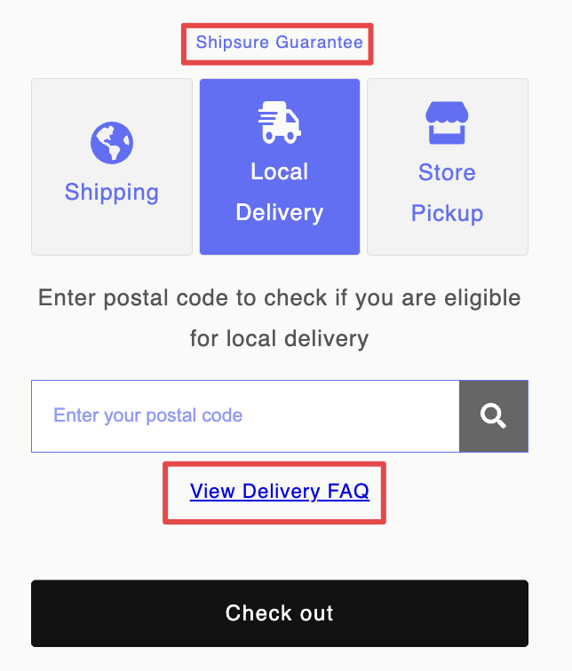
Customize Delivery Method Appearance
Style delivery method buttons and text to match your brand colors.
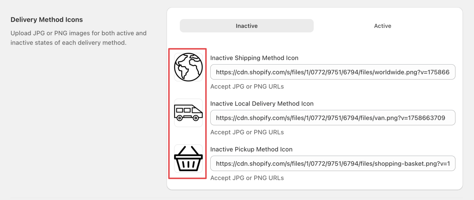
Change Delivery Method Icons
Customize delivery method icons by placing your own icon urls.
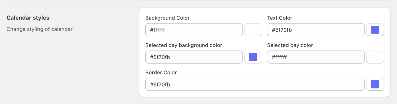
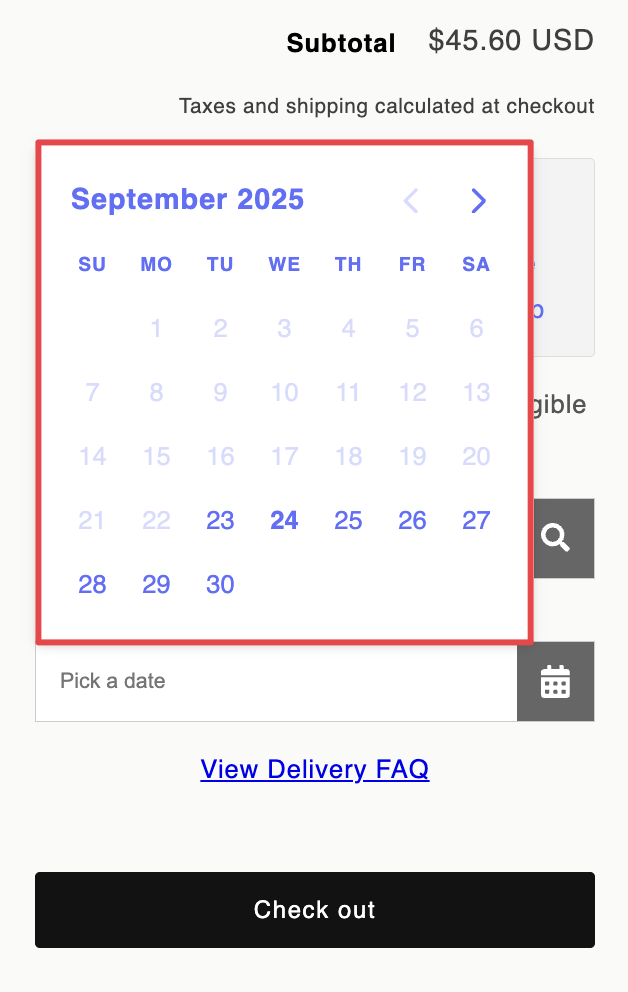
Style Calendar Elements
Customize calendar colors, borders, and text color to match your checkout form.
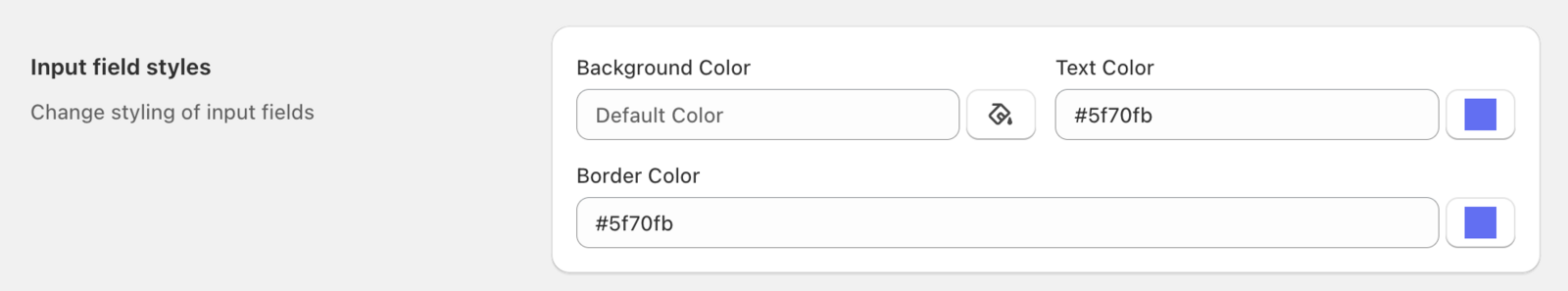
Customize Input Fields
Style date and time input fields to match your form design.
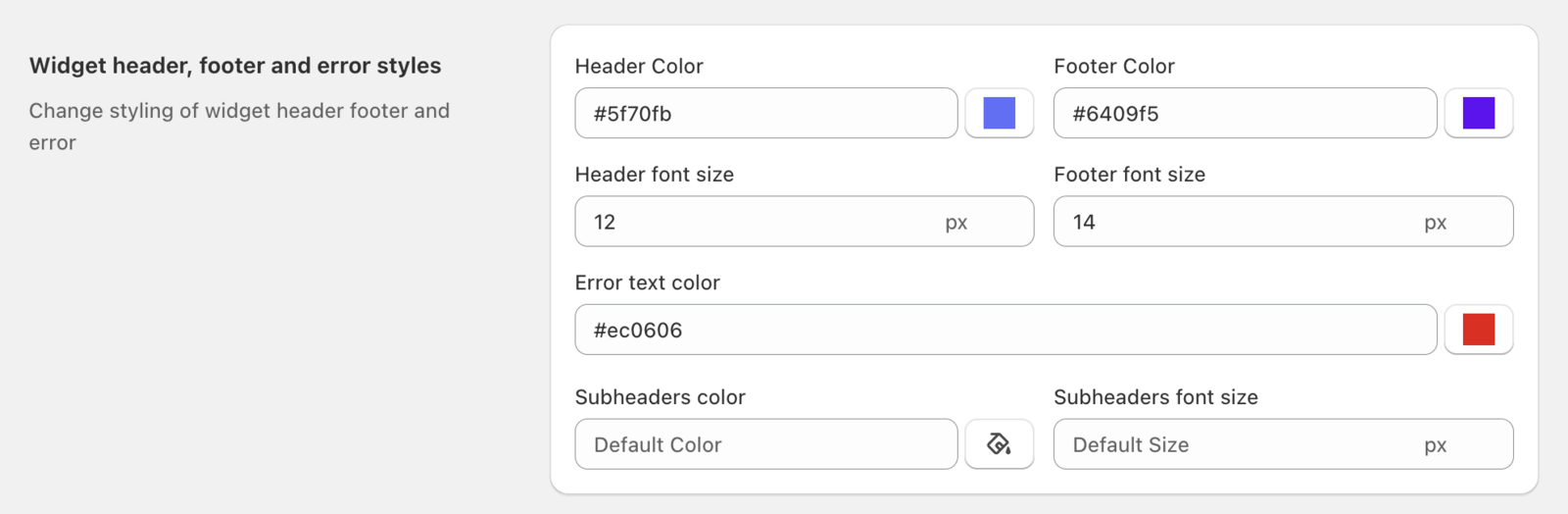
Style Widget Header, Footer, and Error Messages
Customize the widget’s header, footer, and error message appearance.
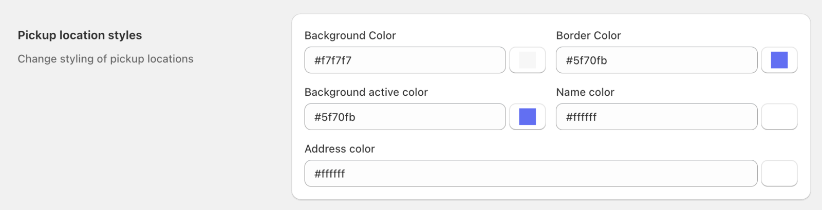
Customize Pickup Location Styles
Style pickup location elements to match your store’s visual identity.
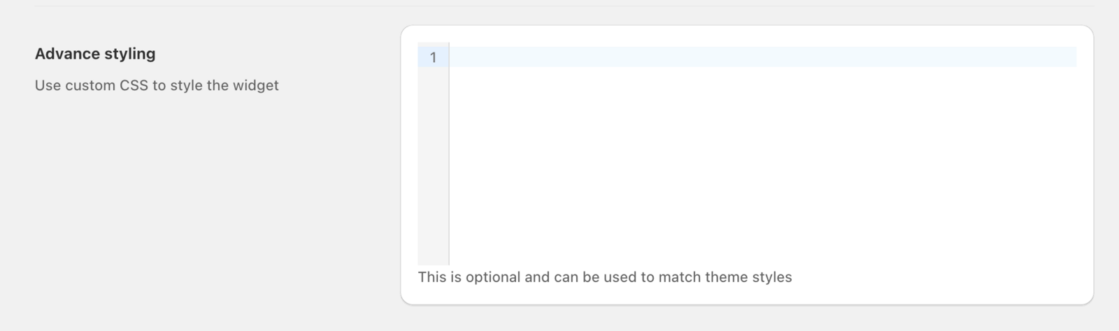
Custom CSS Integration
Add your own custom CSS for complete design control.
Important: Test custom CSS on a staging environment first. Incorrect CSS can break your widget display or cause layout issues.
Enter custom CSS code to achieve advanced styling that goes beyond our built-in options.
Preview and Test Your Customizations
Use the Widget Preview feature to see your changes before they go live on your store.
- Make your desired design changes
- Click Save to apply changes
- Click Widget Preview to view the updated widget
- Verify all settings display correctly

Related Articles
Was this article helpful?
Thanks for your feedback!